

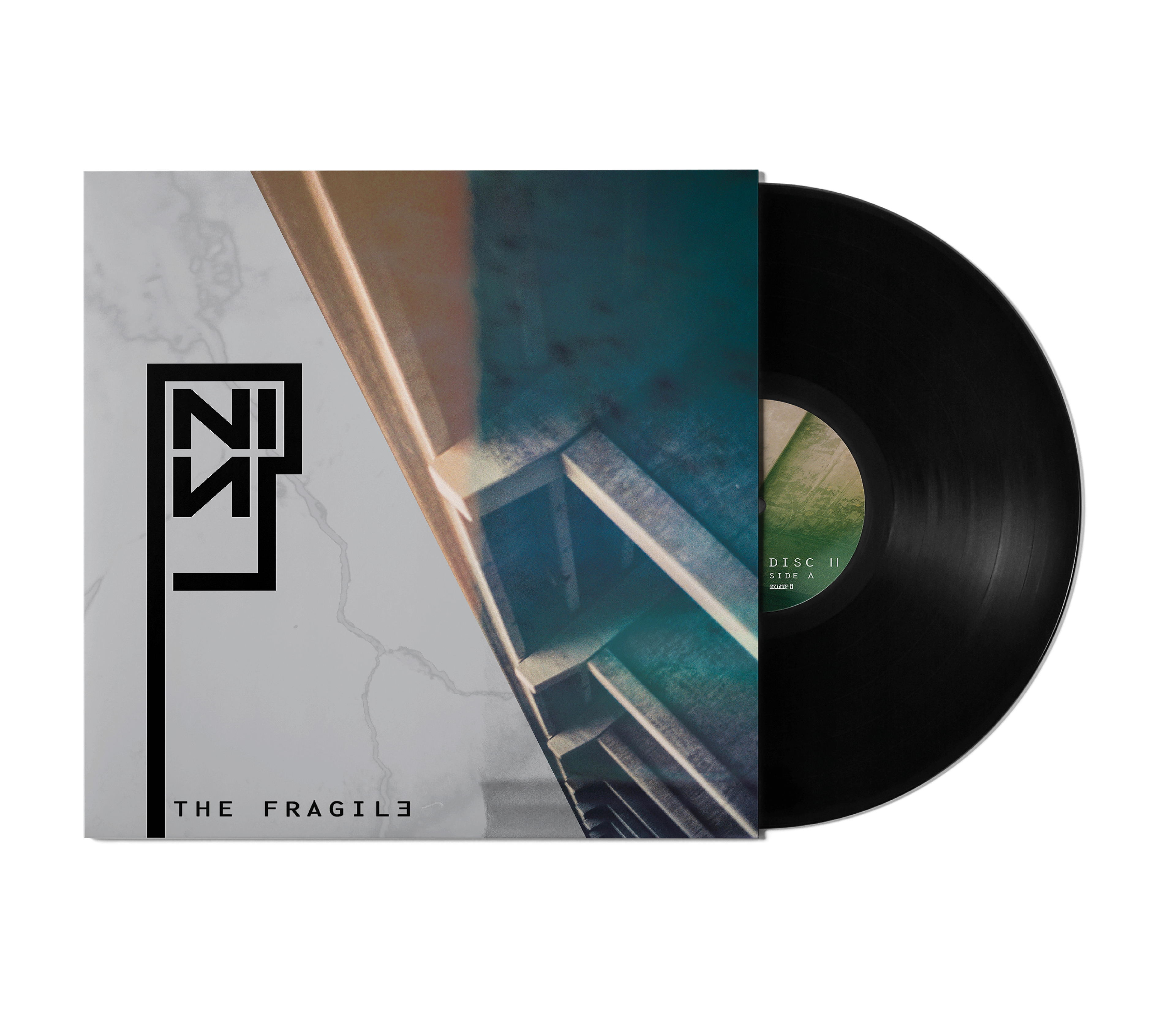
The goal of this assignment was to establish an effective re-design of the American industrial rock band, Nine Inch Nails’ 1999 studio album, The Fragile.
The Fragile is the third studio album by Nine Inch Nails and was released as a double album in September, 1999 by Nothing and Interscope Records. Front man, Trent Reznor describes the album as being “based a lot in fear, because I was afraid as fuck about what was happening to me... That's why there aren't a lot of lyrics on that record. I couldn't fucking think. An unimaginable amount of effort went into that record in a very unfocused way.” Lyrically, the album communicates themes of despair and violence which is further exacerbated through its aggressive and powerful sound.
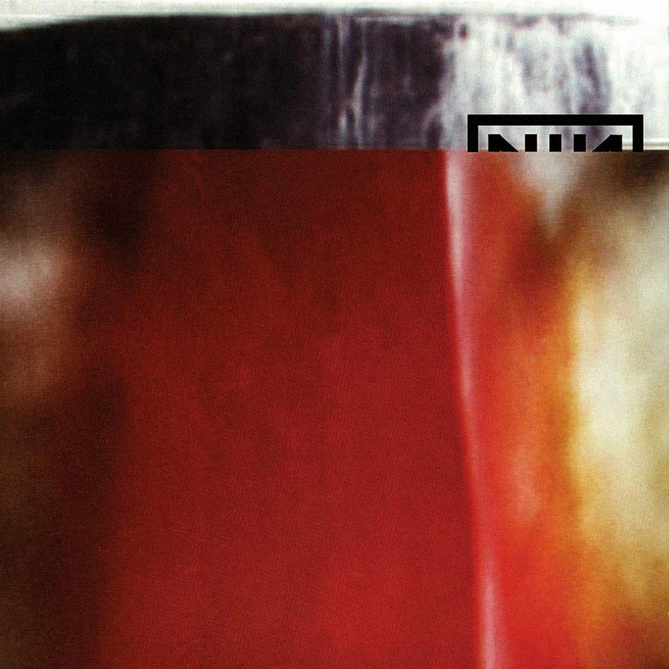
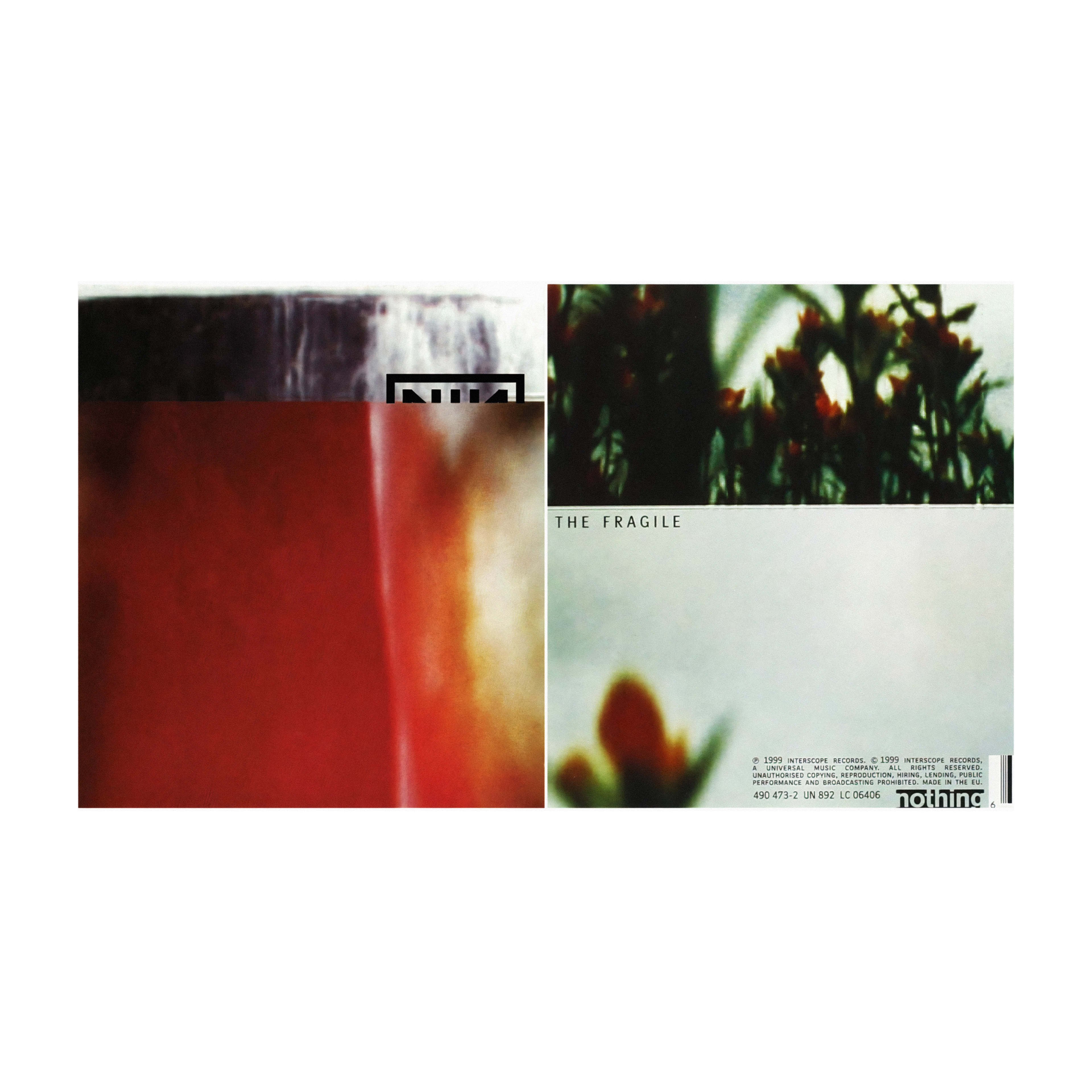
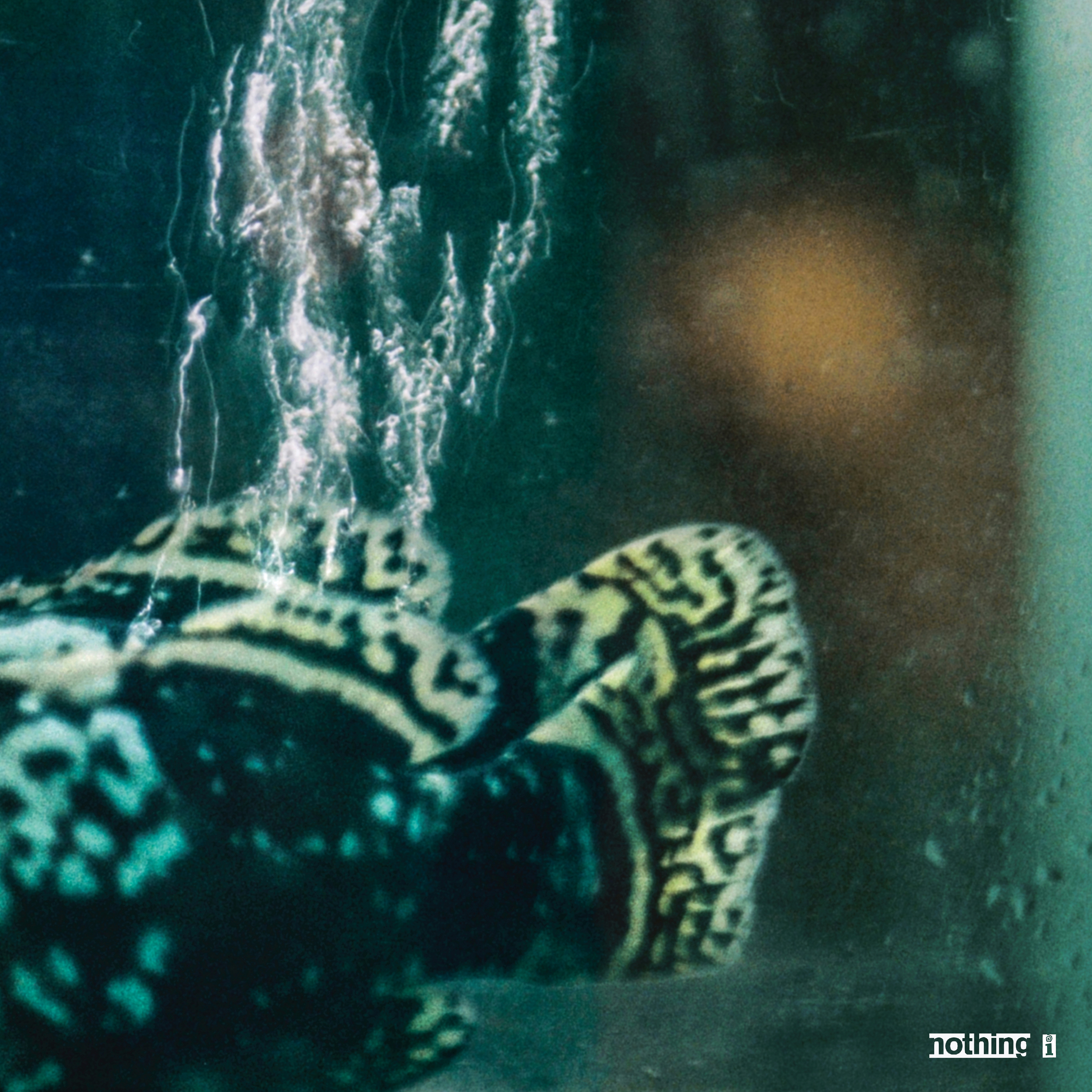
The album cover as well as accompanying merchandise for The Fragile was designed by David Carson. A section from within his book, Fotografiks reveals that the album cover is comprised of two images; the first being a photo of a waterfall which Carson took in Iceland and the second being a closeup of the inside of a seashell, photographed in the West Indies.
PART 1: LOGO DESIGN IDEATION


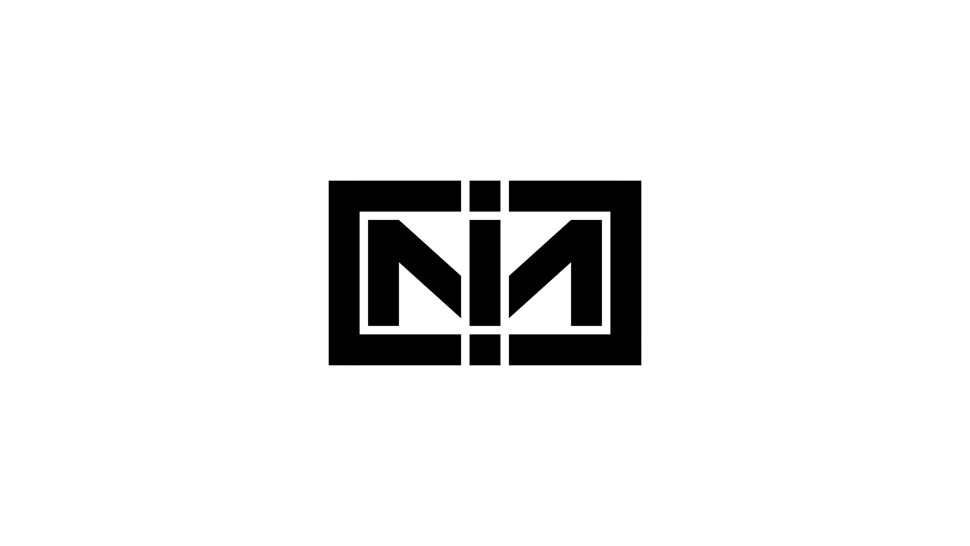


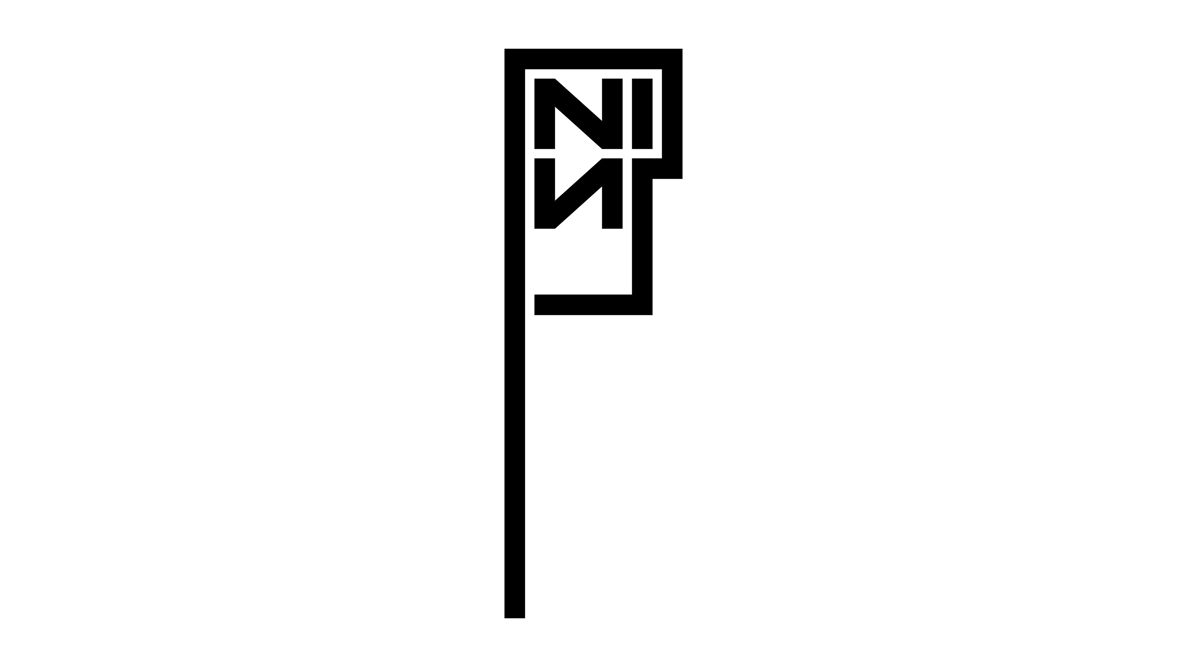
The original Nine Inch Nails logo, pictured at the top of this page, is one which is symmetrical, geometric, bold and decisive. In creating an alteration of this logo for their 1999 album, The Fragile, I felt it necessary to retain the geometric and bold elements of the original logo but to make it asymmetrical which I believed better communicated the chaos and anger of the record's sound.
PART 2: VINYL COVER DESIGN

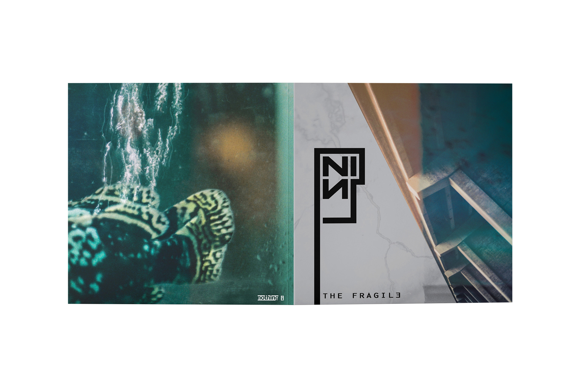
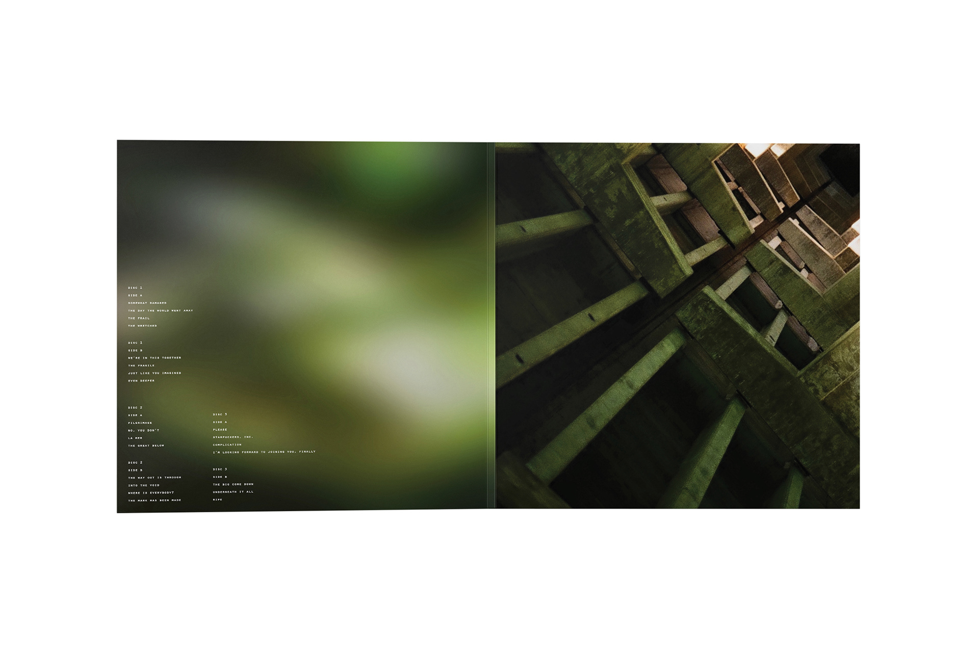
The purpose of this assignment was not to change the distinctive, pre-existing aesthetic of the album or Nine Inch Nails’ visual identity as a whole, but to modify it in order to enhance the communication of their music through image, type and video.
PART 3: VINYL LABEL DESIGN
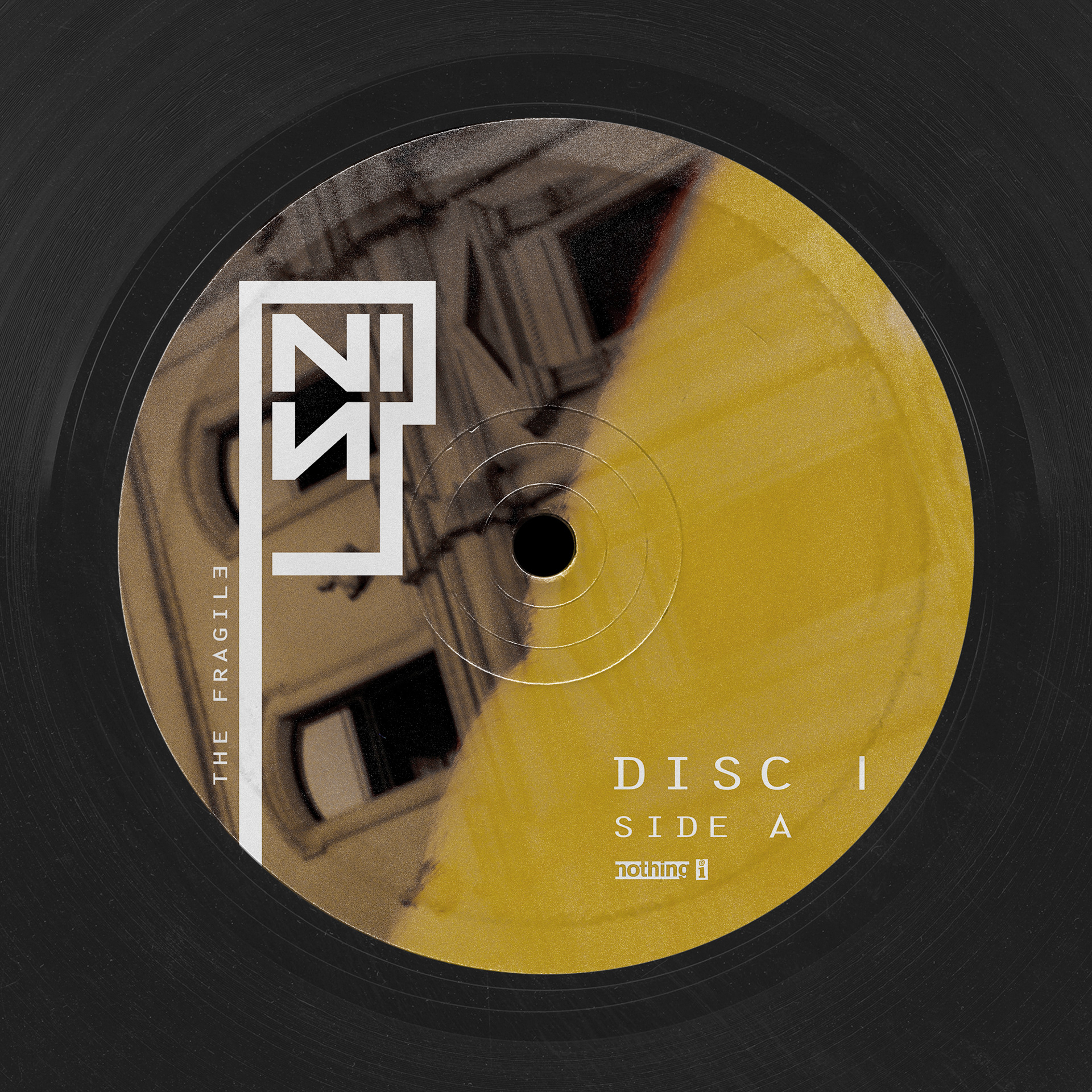
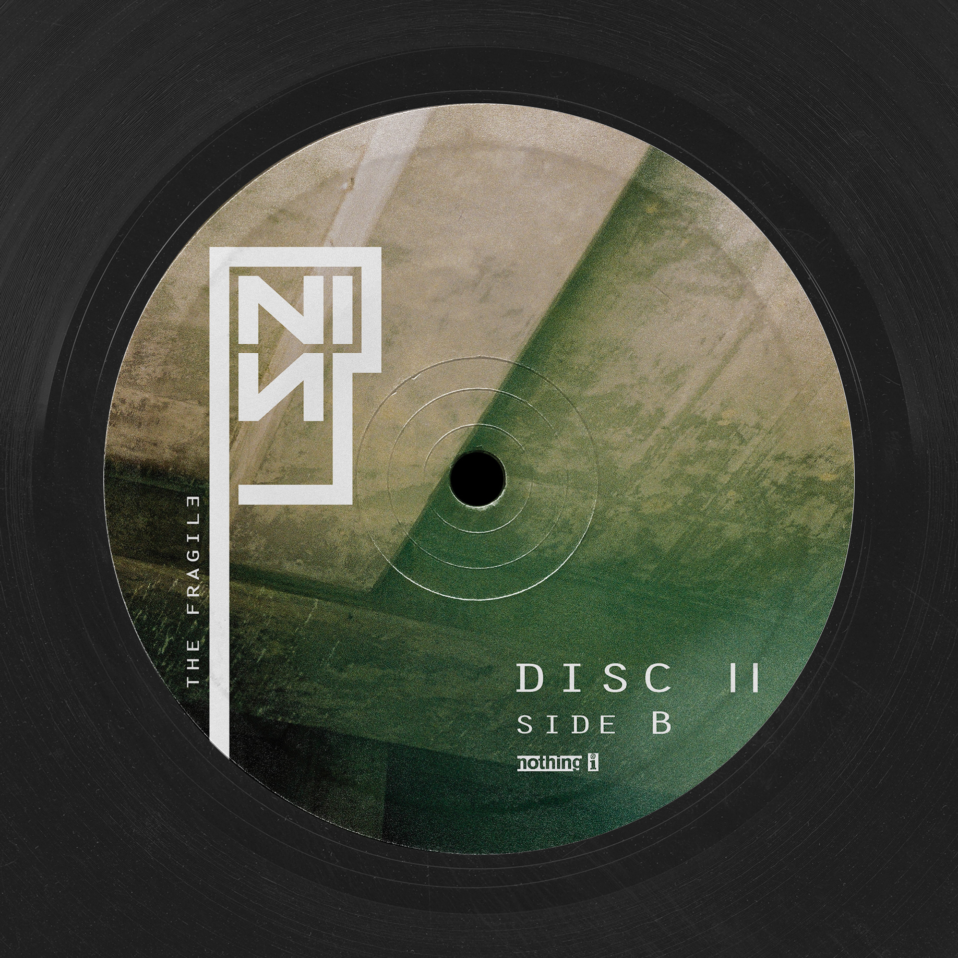
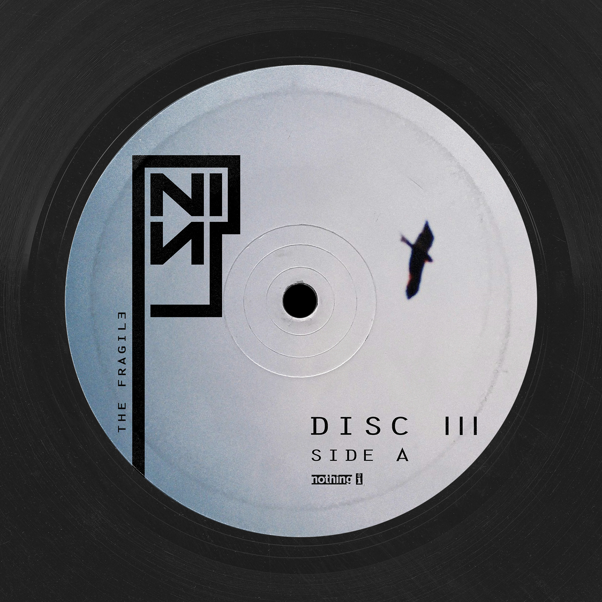
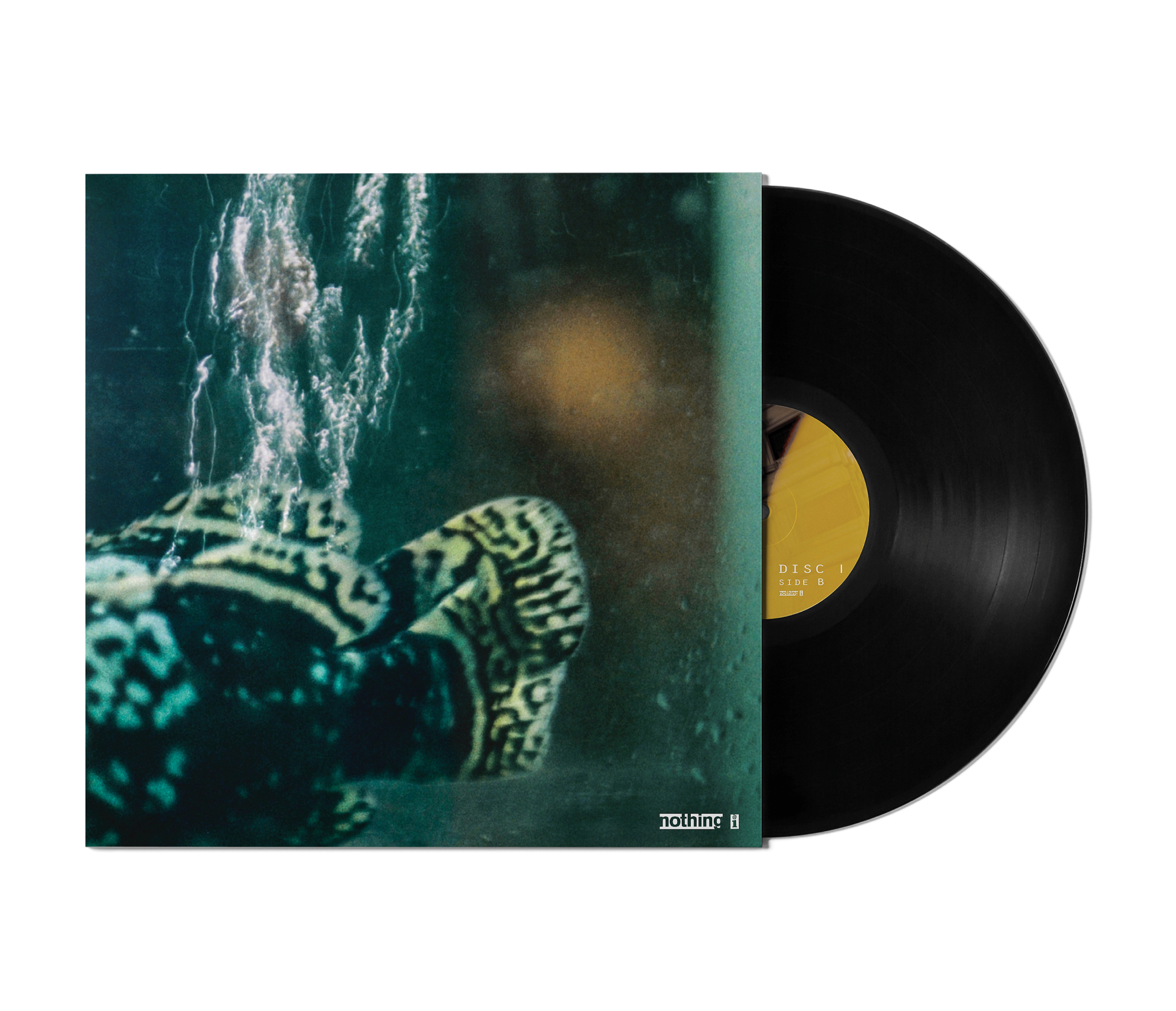
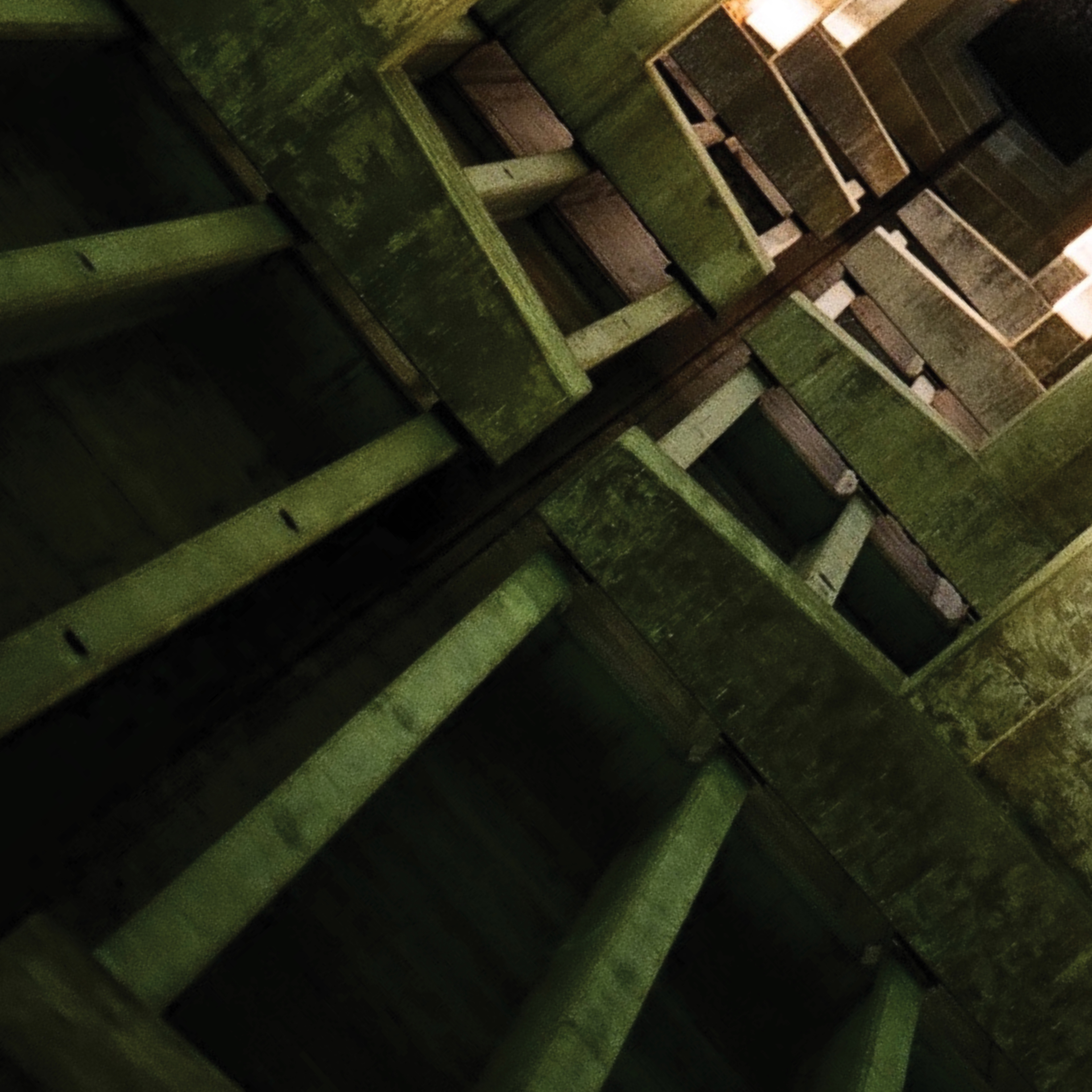
All photographs used within this assignment were taken over a period of three months on a broken 35mm film camera from 1978. Logo and album design was created using Adobe Illustrator and InDesign.
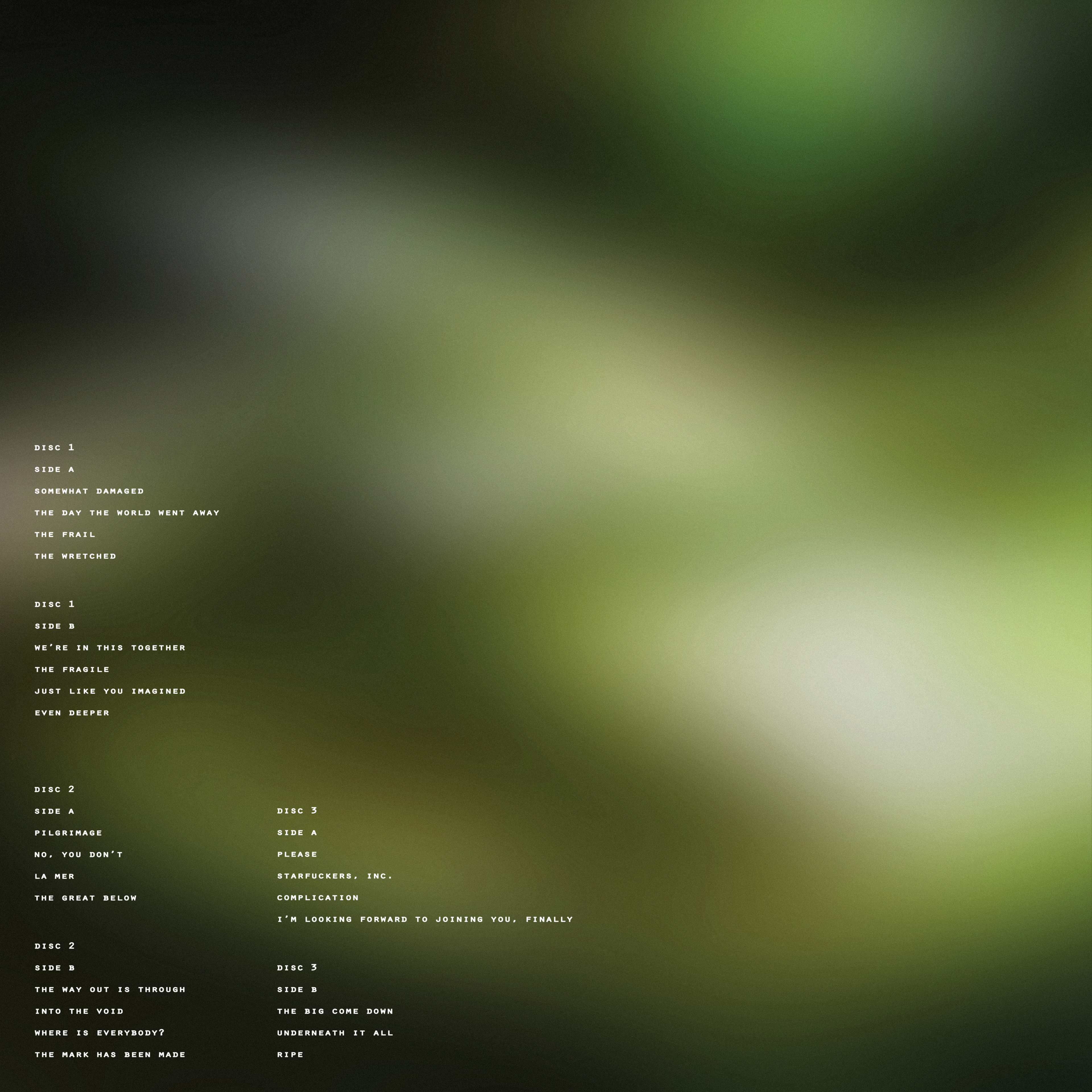
Below is the first commercial which was created as part of the marketing and promotion of this colossal, triple LP album. All logo iterations from the first part of this assignment were placed into video editing software and spliced together to create a stop motion like animation.